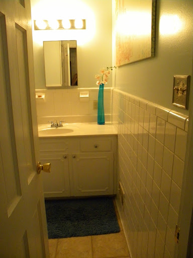
Continuing our house tour (the living room and the kitchen have already been showcased) we will continue with the flow of the house. Flowing right into our guest bathroom. Convenient, eh? Let me just say, I love this bathroom. Our bathrooms have definitely gone through quite a tremendous transformation, although I am a bad blogger and do not have before and afters. I didn’t really take pictures of the house until I started the blog. To give you an idea, the bathroom was covered in an ugly yellow tan color (including trim, ceiling and walls). Also, a little before my time in the house there was a pink toilet and pink sink. Eric changed those out before I moved in. The shower however was pink when I moved in. That didn’t last too long with the amazing Rebath product that will come and cover up your ugly, old bathroom. With that done I was left to painting and accessorizing.
A closer view of the bathroom. You can see the transformation a little paint will make. This bathroom seems so light and airy (although devoid of windows) with the light blue paint on the walls. A white ceiling and white trim work helped as well. The blue vase was a thrift store find that I love.
A shot of the shower. I credit Eric for the shower curtain. I am usually a fabric shower curtain kind of girl, but he got this one to with its little clear blocks mixed in with the blue to allow as much light as possible in the bathroom. Good job hubby! You can also see the white (fake…shhhh) marble peeking up outside of the curtain.
Ahh, my favorite part of the bathroom. A piece of Ikea artwork (which we are acquiring quite a collection of. Not valuable but so fun!). I saw this piece and it was one of those”Squeal!”, run up to the piece, grab it possessively, and say “We are getting this. It is perfect for the bathroom.” Then in it goes into the cart. I loved the colors: the blue matched the bathroom but also subtly suggested other colors to bring in as accents. Think peach towels. That is my plan! It also have little squares that mimic the shower curtain. It is also a very large size that fits perfectly on the big wall leading into the bathroom to the left of the sink (look at the very first picture to see how it fits in relation with everything else).
Another shot of artwork in the bathroom. I am a huge lover of Van Gogh and do not mind having prints in the house. This one actually came in a horizontal poster with the three in a row. I cut the three pictures into individual ones and put them in their own frames to make it look more like a collection. The colors work well in the bathroom, but I am not in love. I like the spacial usage, but they seem a little dark in the bathroom. My goal was to get white frames but I could not find the size I needed. I did find black. I thought I would put them up black and give it a try. I have been giving it a try for a few months now. Still not working exactly. I think they will soon meet a friendly spray paint can and become white. Any thoughts?
This picture gives you a sense of where the pictures are in relation to the bathroom.
Well that is the bathroom tour. How fascinating, right? We still have plans to change out the mirror and light fixtures to something more modern. I also need to find the perfect decorative touch to go over the toilet. There is just a blank wall screaming “Put something on me!” Any thoughts on good bathroom decorations that mix storage, usefulness, and appeal?


[…] Bathroom (check out the whole tour here): Master Bathroom (check out the tour here): They aren’t terrible looking but they aren’t […]
[…] Guest Bathroom […]
[…] like I talked about in my guest bathroom tour before, this bathroom was also “Rebathed” to cover ugly brown/pink tile on the wall and […]
[…] That leads straight into the kitchen. Then we took a trip down the left side of the house to the guest/hall bathroom. Then we skipped the smallest bedroom across from the bedroom (which is what we are doing today!) […]
[…] frames in the guest bathroom were first on my […]