As you saw in my last mantel post, I have been all about finding inspiration for our mantle. I have longingly gazed at other people’s’ mantel masterpieces and asked why couldn’t mine look like that? Well, really there’s no good reason that it couldn’t! I decided to take this first self-induced mantel styling challenge by shopping our house (read – no buying). I am thinking I want to be that person who constantly changes up the mantel on my mood or the season, so this is my first shot before it becomes a glorified Christmas mantel.
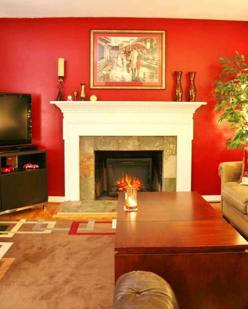
Here is what the mantel looked like before I cleared it for a clean slate.


The first step in any styling challenge I do is to gather a mass of items that could possibly work on the mantel. It really helps for me to just pile them together and then start playing with them – placing this here and then there. Stacking them and then grouping them until it feels right.

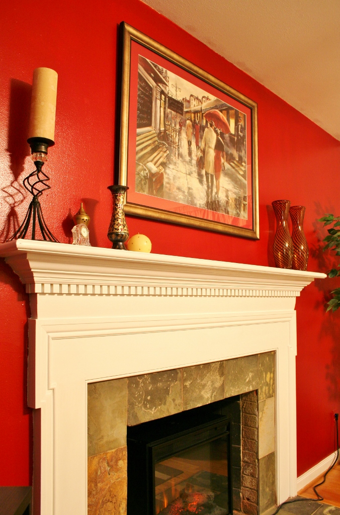
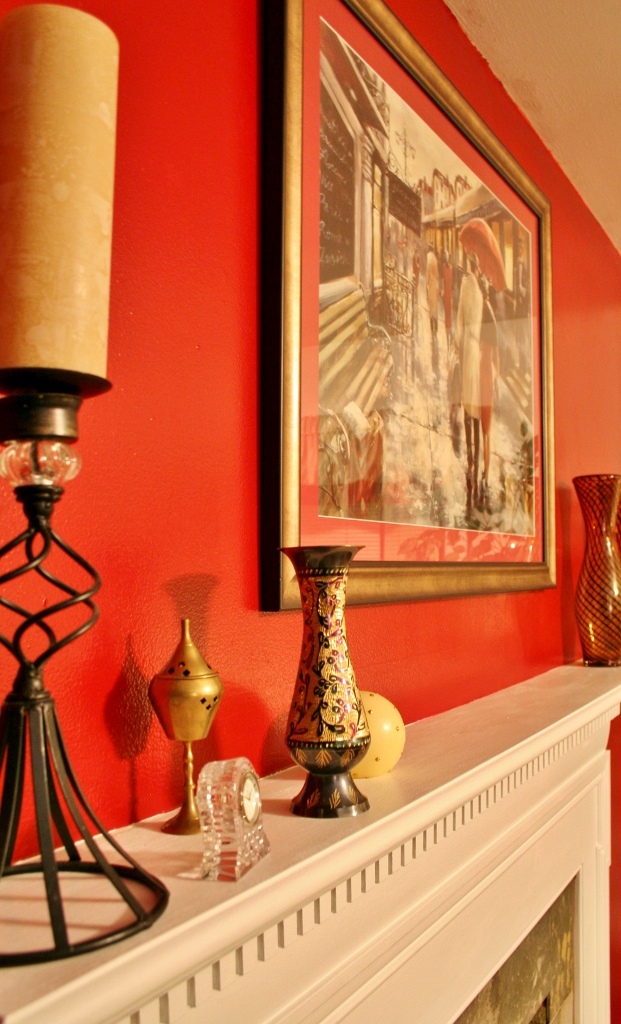
Now, after my playing and using what I have, here is the golden result.


But here is where it gets real. I have a finished product that I am very happy with. But just because of one inspiration post I am not a mantel styling master-woman (shocking, right?). I’m still learning. I have more ideas and it’s not perfect. But hey, life’s not perfect and that’s more interesting, right? Even though it’s not perfect, I’m perfectly happy with the results! I love looking at the mantel, gazing at it’s sparkly goodness. The best thing is, the more I style and redesign it, the better I will get (and the more eye candy you will get).
While I did share an inspiration post with ideas on how to style a mantel, I learned a few more things along the way with Mantel 2.0.
First, a color scheme really helps tie unlike items together. It just happened that I had a lot of gold items around and that gold just looks amazing with that rich red wall. Foe example, the succulent pot wasn’t tying into the rest of the items but a band of gold ribbon helped bring it into the fold.

It’s really important to mix item sizes, shapes, and items that are horizontal or vertical. I realized that I had recurring themes of round and square. I didn’t like all the same shape together so I would try to mingle the shapes – but the color scheme kept it together. I did have predominately round items and I know that some decorative stacking boxes would be divine on the mantel. I will need to keep my eyes out for some pretty ones!

So what do you think? Are you team Mantel 1.0 or Mantel 2.0?
Sharing this post here:


[…] Styling a mantel […]