Happy Friday everyone! Hope you all have had a great week and are going to have an even better weekend! I know I am excited to open the FOUR cans of paint that I bought yesterday. Yup, four paint cans and one wall. That’s enough teaser for next week though.
Anyways, the real reason for this post is to talk about my complete site redesign! Email readers, please make sure to click through so you can see it. First of all, I want to thank everyone reading this right now. It is because of you that my blog has grownup so much through these 1.8ish years that I have been blogging.
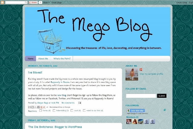
It all started at The Mego Blog (ha! It’s crazy to look at that first post!).

Then after a few months I really found my direction in this blogging world. I knew I wanted my blog to be more focused on Eric and my house renovations and all the fun DIY projects that I was getting braver and braver to try to accomplish. My love for blogging was expanding too. I always knew this was a magical combination for me – writing, photography, and house projects. I was also able to share and maybe even help people.
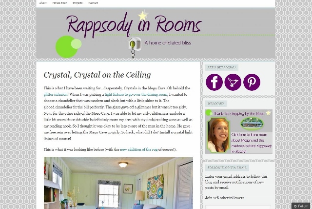
This is when Rappsody in Rooms began.

I loved that the name was a pun (which is soo me) ,and I loved that you could branch off the name with another pun-ish statement, playing with opening doors.
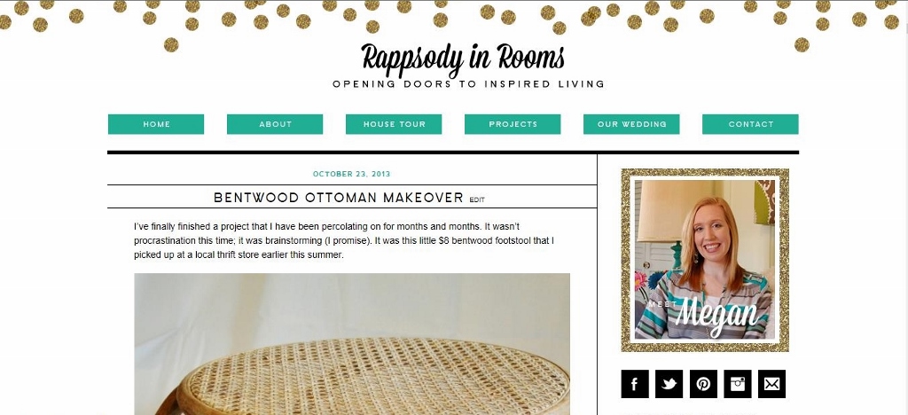
Which is where I came up with my tagline as of today “Opening doors to inspired living.”
Now, we are here, at another milestone for this little blog that has stolen my heart. The art of blogging and the bloggers in my niche create this little bubble of blogging happiness. Here is my new blog design which looks so sophisticated and beautiful on the screen and also boasts a complete transition behind the scenes to self-hosting and unlimited opportunities.

This week has been my “soft opening” of my blog design. I’ve been working through some issues in getting the new site up and running, but I think I’m there. Of course I will always be tweaking the site, but at this present moment I just love to open the site up in a window and gaze at it.
So please, take a look around, leave me a note on anything you love or anything that’s not working for you. I’m always open to suggestions. I would also encourage you to check out my “About Me” page that I have updated. It feels so much more me now, with more jokes, stories, information, and pictures.
Thanks everyone for reading this post, allowing me to ramble and go a little gah-gah over my new site design, and basically just tell you thank you for being here. Cause I really mean it. You rock. Now go one with your bad self and have a great weekend!


Megan, your site looks SO good! I just checked out your about page, and we are totally wedding date twinsies! Marty and I also got married on 4/17/10! Your wedding photos are beautiful and I think my favorite is the one of your dad jumping :).
That’s so cool Jena!! Wedding twins! Isn’t that picture of my dad hilarious?! I love that I didn’t even know it happened until I got the pictures back.