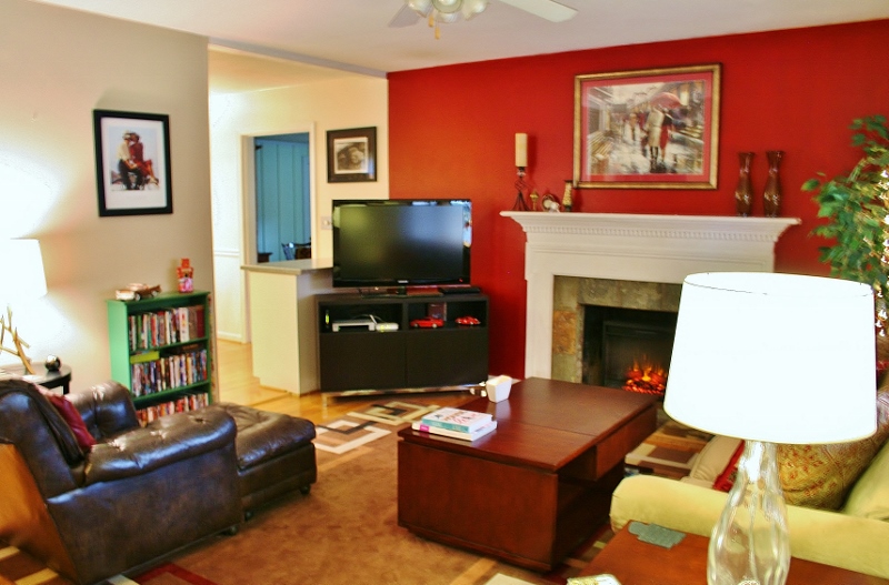
One thing I love about our living room is how comfy, cozy it is and how it is open, yet still structured. Now, that I have buttered it up, I need to say one thing I don’t like about it. I don’t like that is hard to fit a lot of seating in there. Pre-Christmas tree (or PC, not to be confused with BC), this is what our living room was looking like.
It definitely has a nice flow, good conversation areas, and it is easy to watch TV from both the couch and the chair. It worked, except when over 4 people came over, although even four got a little cozy on the couch. Someone would usually grab the ottoman as a seat. It was something that bothered me a little, as I like people to be comfortable in our home.
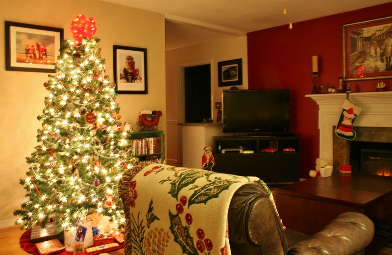
Then came Christmas and with that a little living room reorganization to get the tree into the room. It resulted in a few things moving around, but most notably (for this post at least), the leather chair gave up its throne room for the tree and came over to make an “L” with the couch. For the many, many weeks that the Christmas tree was up in our house (too many to count, at least!), we just oohhhed and ahhhed over how much we liked the chair in that placement. I don’t know why it hit us this year more than others. This has always been the Christmas room setup. I guess it was just timing. Eric and I spent hours sitting in that room and reorganizing it in our minds, saying “What if we moved this there and that there?” throwing around all the possibilities we could think of.
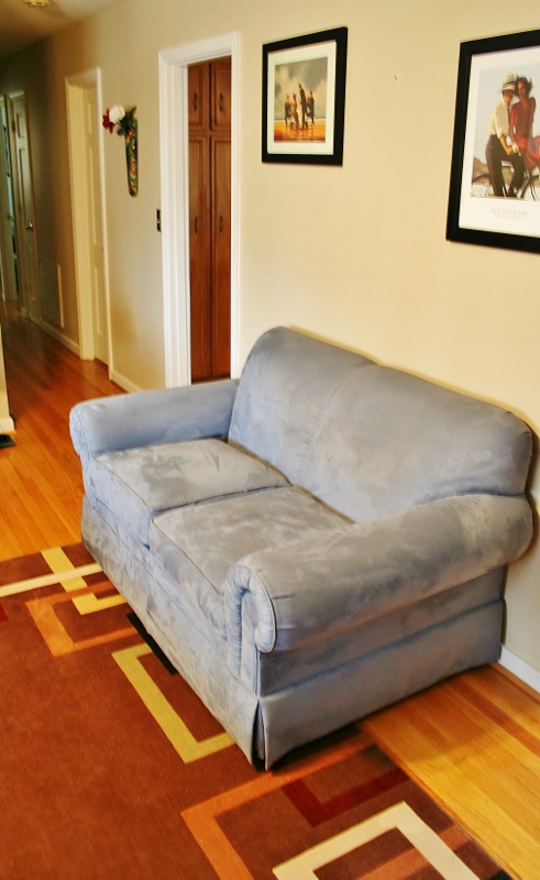
So then came AC (After Christmas) when the tree was gone and there was a void of space. We decided to take that void and play out our “What Ifs…”. It began with carting the loveseat in from the Mego Cave. We used this as a place holder since it was the closest loveseat in the house. If it worked spatially, we would buy a new one for that space. I say this as a disclaimer, which you will see why when you see the pictures.
AH! It’s terrifying! Not only does that color/style not work in the space, we just didn’t like it there from the second we sat it down. It just didn’t work. It was too open to the door and a huge space hog. No. ‘Nough said.
Then we decided to move the chair back to its original wall and give the love seat a try where the chair used to be. We did this expecting to hate it immediately. And then it surprised us.
It’s not great, but it’s not as bad as we thought it would be. Actually better than the first option. But we still didn’t think it worked. It just cut off the living room too much. Too much furniture and too bulky. No again.
The next option was carting that loveseat back into the Mego Cave (scratch having a loveseat in the living room along with the couch) and it came time to play with chairs. We brought in a chair from the Mego Cave and moved the leather chair back to its original space (these were just place holders again).
We liked it okay, but it didn’t create the best usage zone for our living room. Now people in both of those chairs couldn’t comfortably watch TV, and well, it just didn’t work for us. We didn’t love it.
Next up (it just keeps going!) was to move the leather chair back to its “L” formation and try having two chairs over by the wall. Again, placeholders.
Not terrible if you imagine two tufted, comfy chairs over there. Probably matching to make it less crazy on the eye. With that option, we thought we were out of possibilities. None of them seemed right to us, so we decided not to force the issue and just go back to our normal set-up. And you know what happened after that? We hit upon the perfect set-up.
BAM! Not even a place holder! And this was all the hub’s idea. That’s my man! This is a chair that we bought from a friend in town for a deal, and it has been floating around our house. It has had its longest residence as my desk chair in the Mego Cave, but it’s actually too short for it. So when we brought it in here, with this set-up, we were thrilled. The colors match perfectly. The size it great. The layout is perfect! Wahoo! One more seating option in the living room. The only downside is that the chair is not the most comfortable in the world, so it may be changed out one day. For now, it is going to hang out by the wall, looking down right gorgeous in the room. Hooray! We used what we had and hit upon something that really worked for us. I see it as $500 back in our pocket now that we don’t have to buy a loveseat!
PS – These photos are all real life baby! With all the furniture moving around it definitely isn’t staged and just shows us living. Thanks for understanding and letting us live. Plus, with all those arrangements, and most of them looking ugly, there was no need to try to put a pillow on it to try and make it look better!


[…] Moved around the layout to accommodate more seating […]
[…] in our house – we’ve always wanted to have more seating in there. You saw how we did some shuffling with the layout after Christmas last year and resulted in this layout. Here is what it was looking like after that […]